Indifference Curve
What Is an Indifference Curve?
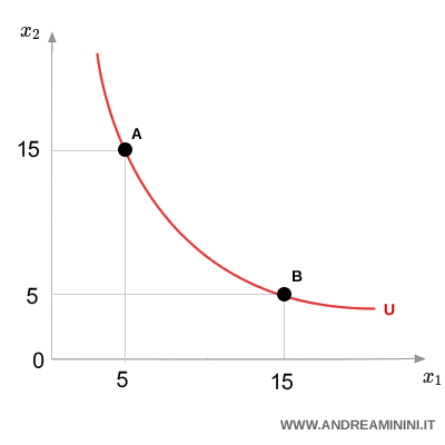
An indifference curve shows all the combinations of two goods that give a consumer the same level of satisfaction - or utility.
Each point on the curve represents a different bundle of goods, $x$ and $y$. If two bundles lie on the same curve, the consumer doesn’t prefer one over the other - they’re equally happy with either.
Example. Say a consumer is just as satisfied with bundle A = (5 apples, 15 pears) as with bundle B = (15 apples, 5 pears). That means A and B fall on the same indifference curve - they deliver the same utility.
Why does it matter?
Indifference curves help us visualize consumer preferences. They show which combinations of goods a person values equally, and how they make trade-offs.
Note. This concept is a key tool in microeconomics, especially when combined with a budget constraint. Together, they help explain how consumers make choices to get the most satisfaction from their spending.
Comparing Bundles and Utility
Each indifference curve reflects a specific level of utility. The farther the curve is from the origin, the higher the utility.
This is based on the idea that more is better - the more goods you have, the more satisfied you are (assuming everything else stays the same).
Example
Imagine a consumer choosing between two goods, $x_1$ and $x_2$. They can pick one of these bundles:
$$ A = (5,10) $$
$$ B = (10,10) $$
$$ C = (15,10) $$
Bundle C is on a higher indifference curve than B, and B is higher than A. So, the consumer prefers C to B and B to A.
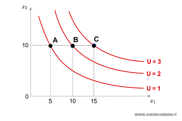
Why? Because C gives them more total goods - and more goods mean higher satisfaction.
Key Features of Indifference Curves
Indifference curves always follow a few simple rules:
- They slope downward: To keep the same utility, if you get more of one good, you need less of the other.
- They’re convex to the origin: People usually prefer balanced bundles, not extreme ones. That’s due to diminishing marginal utility - each extra unit of a good adds less and less value.
- They never cross: Each curve shows a different utility level. If they crossed, preferences would contradict each other.
Why Indifference Curves Slope Downward
Ever wondered why indifference curves always slope downward? It’s simple: if a consumer wants more of one good, they have to give up some of the other to stay equally satisfied. That’s the essence of trade-offs.
This downward slope reflects a basic economic truth - scarcity. Our resources are limited, so every extra unit of one good comes at the expense of another. It’s not just a graph - it’s a visual story of decision-making under constraint.
Example. Suppose you’ve got €10 to spend on bread and cheese. The more bread you buy, the less cheese you can afford. Simple, right?
From an analytical point of view, the slope of the curve shows the Marginal Rate of Substitution (MRS) - how much of one good (say $X_2$) a person is willing to trade for an extra unit of another ($X_1$) without changing their overall happiness.
Why Indifference Curves Are Convex
There’s a reason these curves bend inward: we prefer variety. Most people don’t want all apples or all pears - they like a mix. That’s what gives the curve its classic convex shape.
- When one good is plentiful, its extra value - or marginal utility - drops. The curve flattens out.
- When a good is scarce, each extra unit feels more valuable. That’s why the curve gets steeper.
A Quick Visual Example
Imagine you could buy either 20 pears ($x_1$) or 20 apples ($x_2$). Now suppose you choose a mixed basket - say, 15 pears and 5 apples (Bundle A).
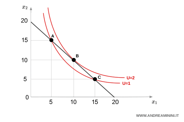
Now compare that with a more balanced option - Bundle B = (10, 10). Both bundles cost the same, but B lies on a higher indifference curve. Why? Because it gives you more satisfaction overall - it’s more balanced, and that’s what we tend to prefer.
So, between A(15,5), B(10,10), and C(5,15), a rational consumer would choose B. It’s the most satisfying mix - and that’s exactly what the convex curve is showing you.
Heads up: Economists often rely on the "non-satiation" assumption - the idea that more is always better. It simplifies the theory by assuming we’re all fully rational and informed, a kind of idealized "homo economicus." Real life? A bit messier. But for now, this model helps us understand the basics of consumer choice.
Marginal Rate of Substitution (MRS)
The Marginal Rate of Substitution (MRS) tells us how much of one good a person is willing to give up to get one more unit of another - without changing their level of satisfaction.
It describes a movement along the same curve - because total utility stays constant.
The MRS can be written like this:
$$ MRS = -\frac{Δx_1}{Δx_2} $$
Here, $ Δx_1 $ is the change in the quantity of good 1, and $ Δx_2 $ is the change in good 2.
Example: If a consumer is willing to trade 1 orange ($x_2$) for 2 apples ($x_1$), the MRS is 2. That means the consumer values 2 apples as equal to 1 orange. $$ MRS = -\frac{Δx_1}{Δx_2} = - \frac{2}{-1} = 2 $$
In terms of marginal utility, the same trade-off looks like this:
$$ \frac{Δx_1}{Δx_2} = - \frac{MU_{x_2}}{MU_{x_1}} $$
Because the consumer stays on the same curve, any extra utility from one good must be canceled out by the loss from the other:
$$ Δx_1 \cdot MU_{x_1} = - Δx_2 \cdot MU_{x_2} $$
Visually, the MRS is just the slope of the indifference curve at a point - that is, the slope of the tangent line at that spot.
So economists often write it like this, using infinitesimally small changes:
$$ MRS = -\frac{dx_1}{dx_2} $$
And that’s how we use indifference curves to better understand consumer behavior.